Abundance Strategies
Rebrand
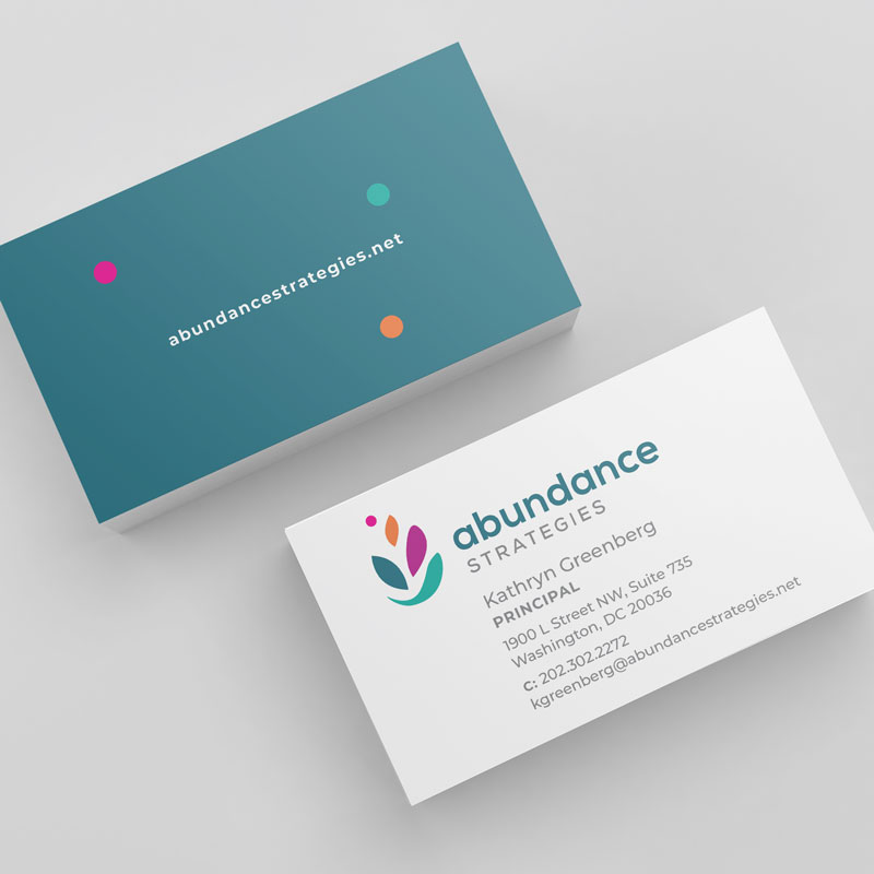
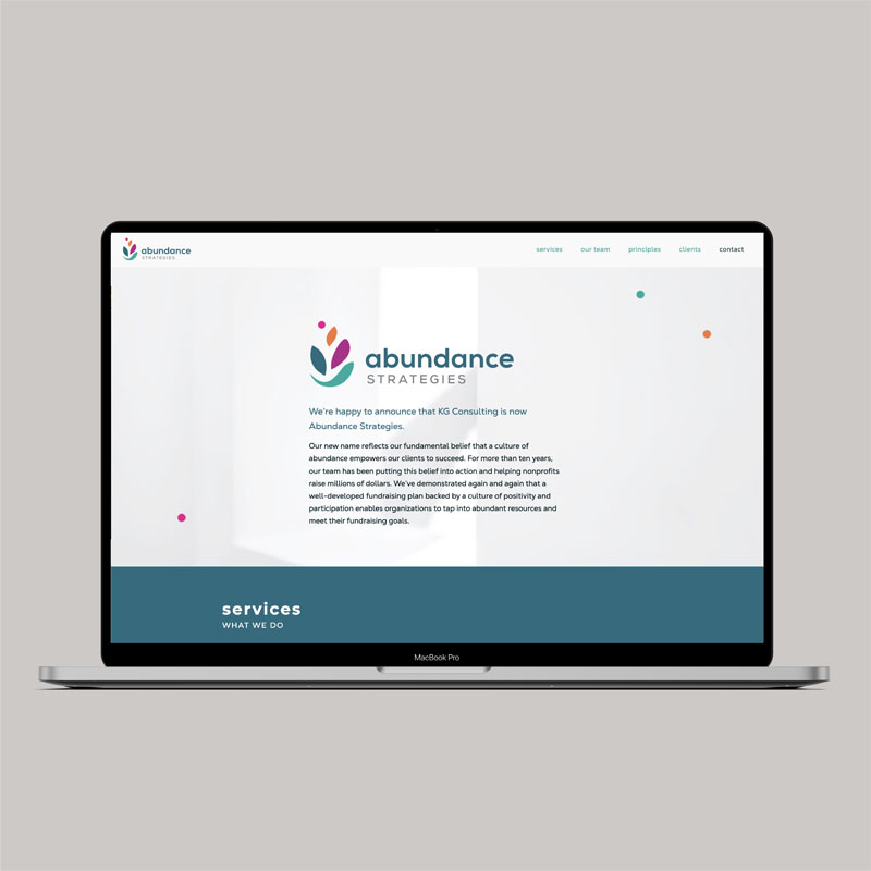
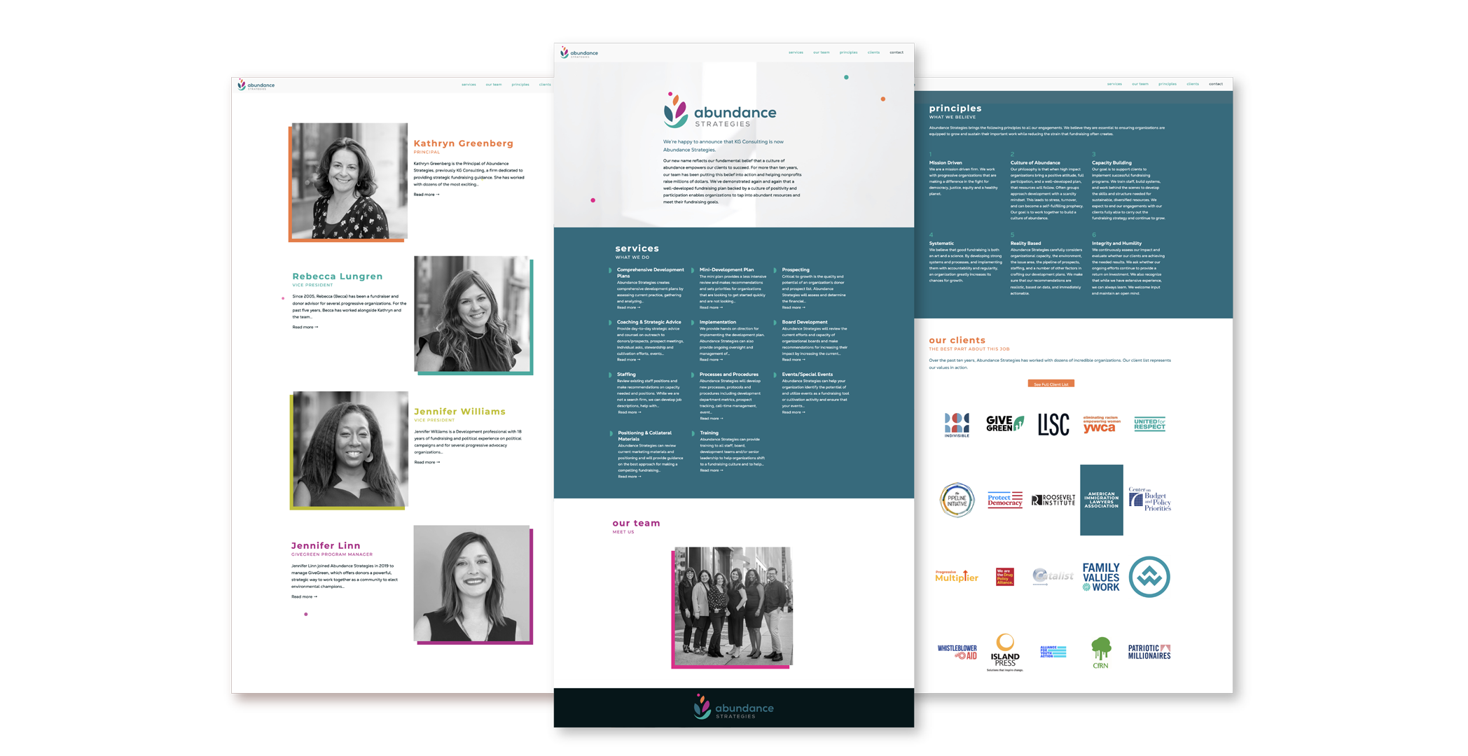
Abundance needed a full rebrand to highlight the company’s growth and change. We developed the logo based on the client’s concept that a culture of abundance empowers their clients, nonprofits, to succeed. Our lively logo mark suggests a bowl o’plenty, with references to growth and life and motion. We carried the theme throughout the identity. The website has a light, bright, airy quality with colorful, playful elements. We designed a sign to brighten and brand the office space, and we encouraged employees to choose their own color from the brand for their personal business card.
Katie, I just shed a tear. Seriously, our website is so amazing!
Rebecca Lungren
Vice President
Abundance Strategies

