Inspired design. Outstanding results.
Inspired design. Outstanding results.
McKenna Daniels Design is your creative business partner. We listen closely, collaborate, and translate your needs into remarkable design solutions.
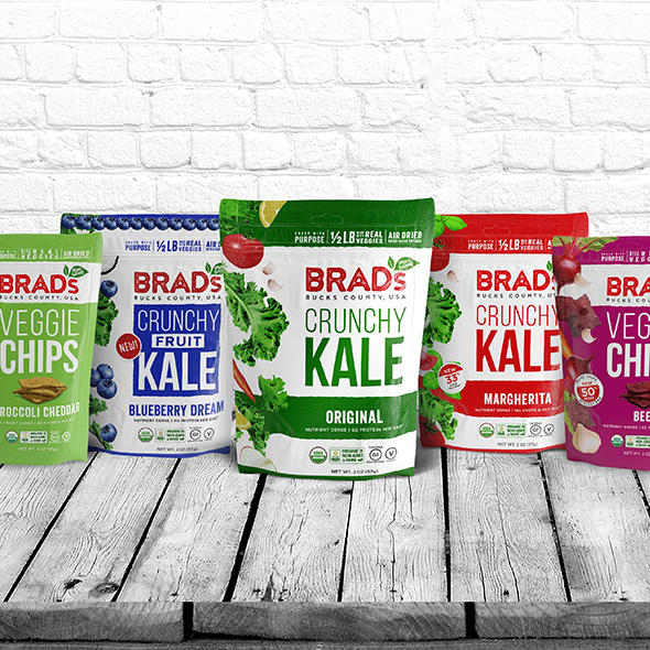
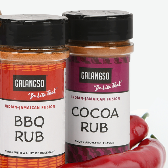
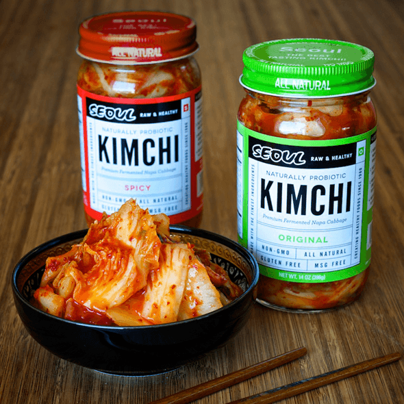
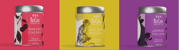
Healthy Path Market
Branding a Health Food Market
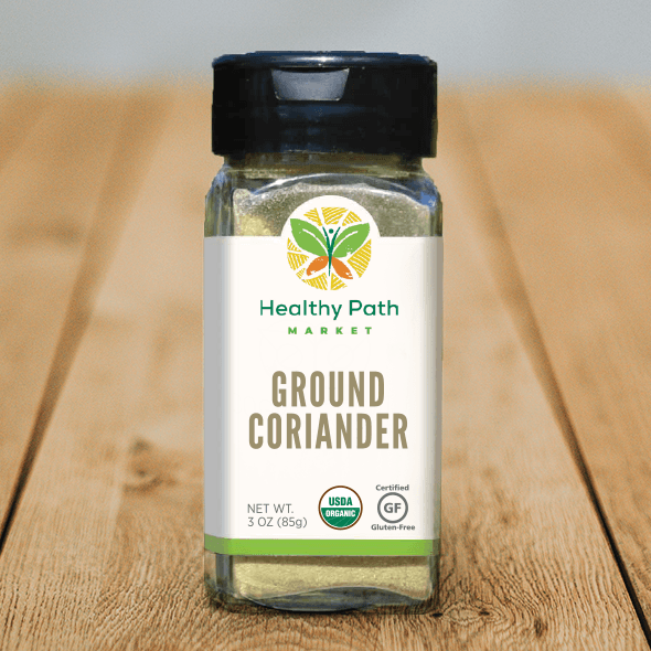
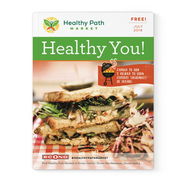
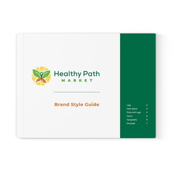
Healthy Path Market has three stores in Puerto Rico. We rebranded them with a colorful new identity system that is applied to everything from signage to uniforms to spice jars. The logo has a combination of thoughtful elements — a butterfly, representing transformation to healthy eating, leaves, representing the natural food sector, and the body of the butterfly doubles as an exuberant person with arms in the air.
More Projects You Might Like