Healthy Path Market
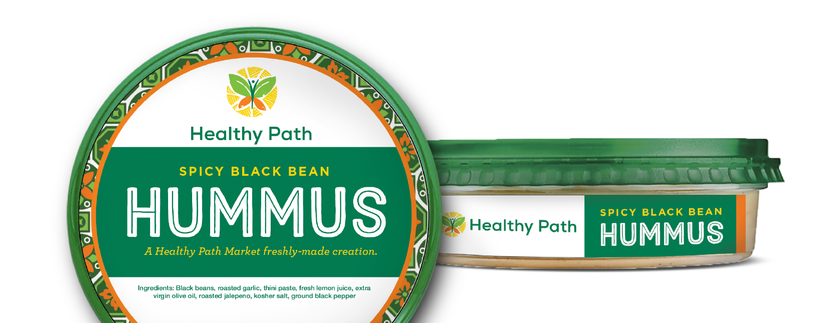
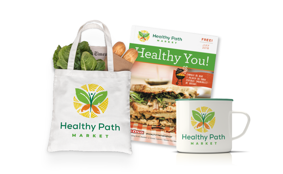
Healthy Path Market has stores in Puerto Rico, within the larger Econo chain. We rebranded them with a successful identity system applied to everything from signage to uniforms to spice jars. The logo has a combination of elements — a butterfly, representing transformation to healthy eating, leaves, representing the natural food sector, and an exuberant person with arms in the air. The rebrand was overwhelmingly accepted at all the Econo chains. The local team has continued the success of the brand across multiple channels. We created a brand that is distinctive, targeted, and was easily transferable to internal teams to manage across all the stores.
Projects: Brand strategy and logo development, brand standards guide, messaging and copywriting, package design, publication design, merchandise, and signage.


