Abundance Strategies
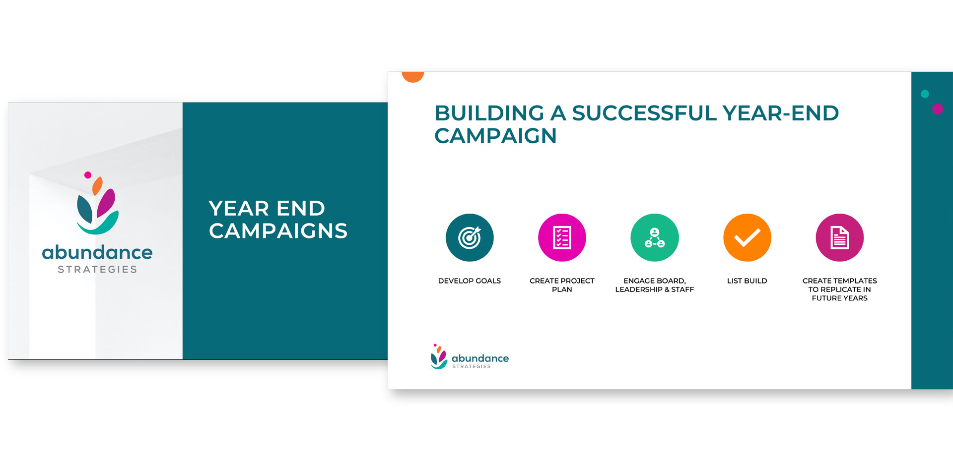
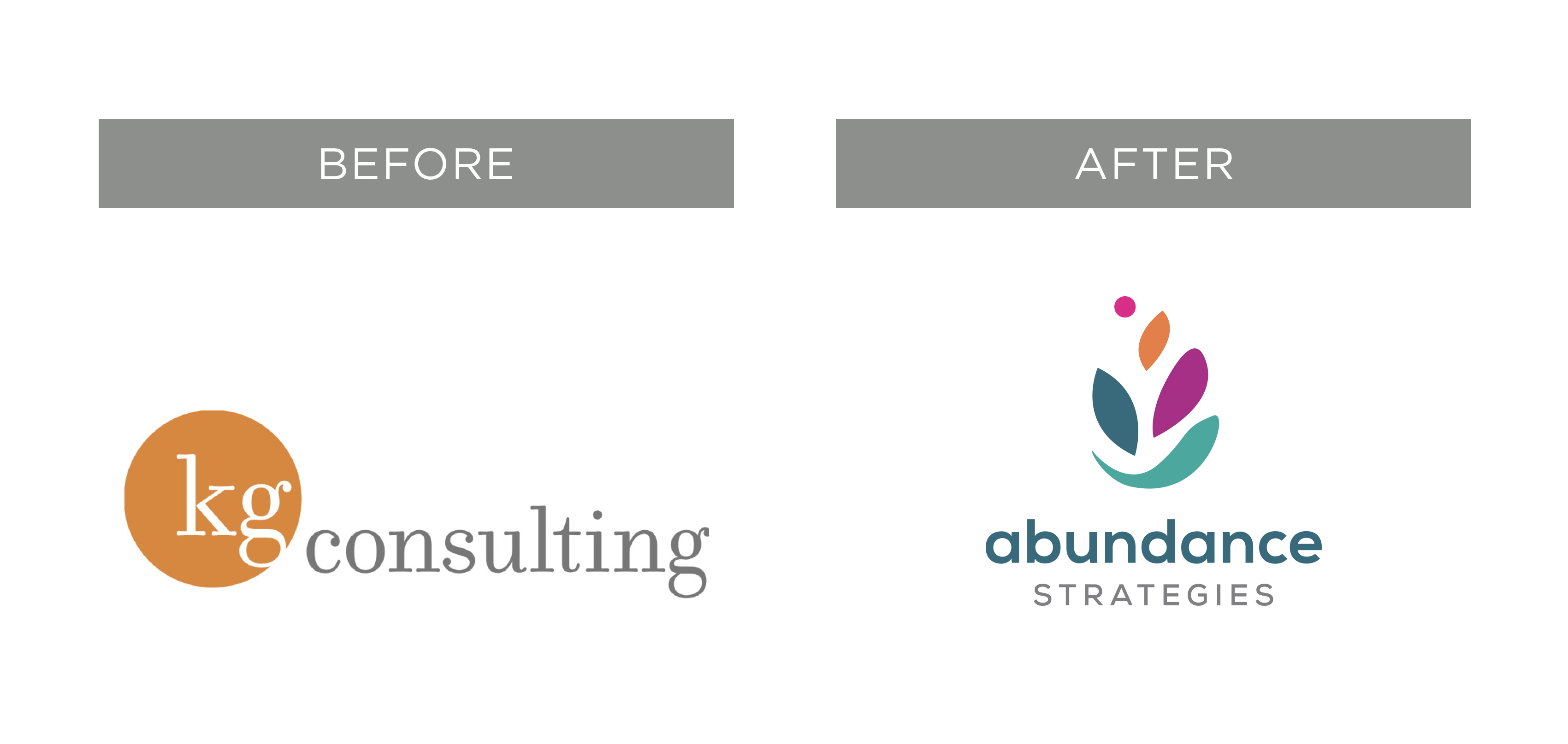
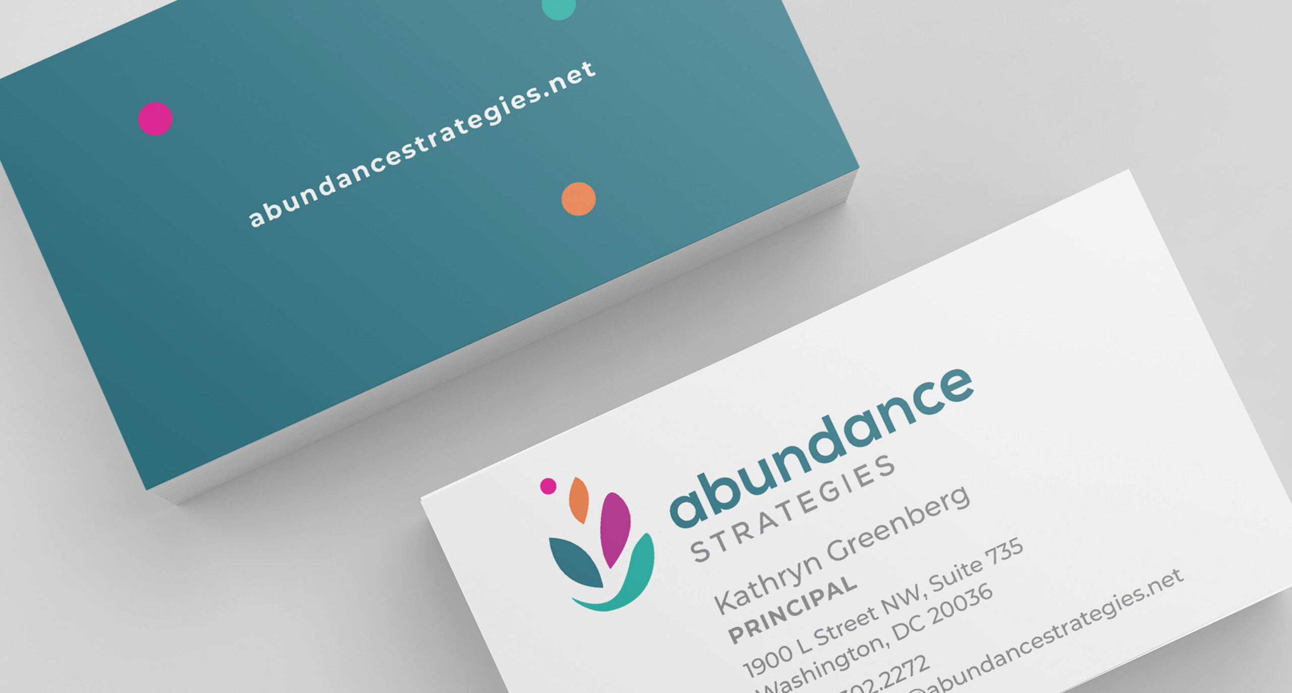
Abundance needed a full rebrand to highlight the company’s growth and change. We developed the logo based on the client’s concept that a culture of abundance empowers their clients, nonprofits, to succeed. Our lively logo suggests a bowl o’plenty, growth, and life. The website has a light, bright, airy quality with colorful, playful elements. We designed a sign to brighten and brand the once space, and we encouraged employees to choose their own color from the brand for their personal business card and once wall color.
Projects: Brand strategy and logo development, messaging and copywriting, identity package, website design and development.

